NavigationRail
import { NavigationRail } from "@material";export component Example inherits Window { width: 400px; height: 300px; background: transparent; NavigationRail { width: 80px; height: parent.height; items: [ { icon: @image-url("../icons/share.svg"), text: "Home" }, { icon: @image-url("../icons/search.svg"), text: "Search" } ]; }}slint
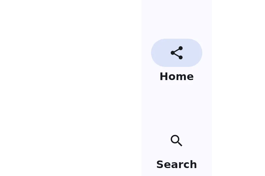
A NavigationRail is a vertical navigation component that displays navigation items with optional menu button and floating action button.
Properties
Section titled “Properties”alignment
Section titled “alignment”enum LayoutAlignment default: the first enum value
The alignment of the navigation items within the rail.
current-index
Section titled “current-index”int (in-out) default: 0
The index of the currently selected navigation item.
fab-icon
Section titled “fab-icon”image default: the empty image
The icon for the floating action button.
has-menu
Section titled “has-menu”bool default: false
Whether to show a menu button at the top of the rail.
[struct] default: a struct with all default values
An array of navigation items to display in the rail.
Callbacks
Section titled “Callbacks”index-changed(index: int)
Section titled “index-changed(index: int)”Invoked when the current-index changes.
menu-clicked()
Section titled “menu-clicked()”Invoked when the menu button is clicked.
fab-clicked()
Section titled “fab-clicked()”Invoked when the floating action button is clicked.
© 2026 SixtyFPS GmbH