ModalNavigationDrawer
import { ModalNavigationDrawer, FilledButton } from "@material";export component Example inherits Window {    width: 400px;    height: 300px;    background: transparent;    show_navigation_drawer := FilledButton {        text: @tr("Open Navigation Drawer");
        clicked => {            navigation_drawer.show();        }    }    navigation_drawer := ModalNavigationDrawer {        width: 280px;        height: parent.height;        groups: [            {                title: "Main",                items: [                    { icon: @image-url("../icons/share.svg"), text: "Home" },                    { icon: @image-url("../icons/search.svg"), text: "Search" }                ]            }        ];    }}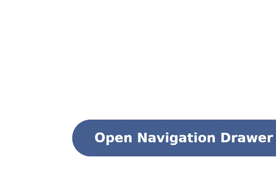
A NavigationDrawer is a side panel that contains navigation items organized in groups, typically used for app navigation.
Properties
Section titled “Properties”current-group
Section titled “current-group”int (in-out) default: 0
The index of the currently selected navigation group.
current-index
Section titled “current-index”int (in-out) default: 0
The index of the currently selected navigation item within the current group.
groups
Section titled “groups”[struct] default: a struct with all default values
An array of navigation groups, each containing a title and navigation items.
Functions
Section titled “Functions”select(group-index: int, item-index: int)
Section titled “select(group-index: int, item-index: int)”Selects the navigation item at the specified group and item indices.
Callbacks
Section titled “Callbacks”selected(group-index: int, item-index: int)
Section titled “selected(group-index: int, item-index: int)”Invoked when an item is selected. group-index is the index of the selected group and item-index the selected index in that group.
item_pointer_event()
Section titled “item_pointer_event()”Emitted on any mouse pointer event similar to TouchArea. Arguments are the group and item index associated with the event, the PointerEvent itself and the mouse position within the NavigationDrawer.
© 2026 SixtyFPS GmbH